When I first started building my site, I assumed WordPress would automatically take care of everything optimized for mobile. I believed a responsive theme and a few layout adjustments would handle the rest. However, the more I worked on my website, the more I realised that mobile optimisation is a conscious design practice. It requires intention, testing, and ongoing refinement. And because most people browse on their phones, each improvement — even tiny ones — can noticeably improve how your site feels.
In this post, I want to share the practical steps I took to create a genuinely smooth mobile experience using WordPress, Astra, and Elementor. Additionally, I’ll link to some internal guides I’ve written in case you want to explore any topic in more detail.
If you’re wondering how I ended up learning SEO, CRO, and digital behaviour in the first place, I’ve documented the journey here:
Why I’m learning SEO and CRO
Why Mobile Optimisation Matters Today
Mobile browsing isn’t an alternative anymore — it’s the default. In many industries, mobile devices account for over 70% of total traffic. Consequently, your website isn’t being casually “viewed” on a phone. It’s being judged, interpreted, and acted upon there. Moreover, first impressions on mobile often shape whether someone stays, engages, or leaves.
Additionally, Google’s mobile-first indexing means the mobile version determines how your site ranks. Therefore, being optimized for mobile isn’t just a design preference; it’s a direct SEO factor. It also influences conversion rates, trust signals, and user satisfaction.
This shift pushed me to rethink how I build pages. Instead of starting with desktop layouts and adjusting downward, I began designing with the mobile experience first. Ultimately, this mindset made everything simpler, cleaner, and more predictable.
Start With a Mobile-Friendly Theme (Astra)
Choosing Astra early on was one of the most helpful decisions in my WordPress journey. It’s lightweight, flexible, and intentionally built for speed. Because of this, Astra simplifies many parts of mobile optimisation before you even touch a layout.
If you’d like a deeper breakdown of my setup process, you can read the full story here:
Building my first website with WordPress and Astra
Why Astra makes mobile optimisation easier
- It loads quickly right out of the box.
- It includes responsive typography settings.
- It offers dedicated mobile header controls.
- It works seamlessly with Elementor.
Together, these features give you a strong foundation. Furthermore, they help you avoid the frustrating process of fixing issues caused by heavy or rigid themes. By beginning with Astra, you essentially remove several mobile problems before they can appear.
Use Elementor’s Responsive Tools Deliberately
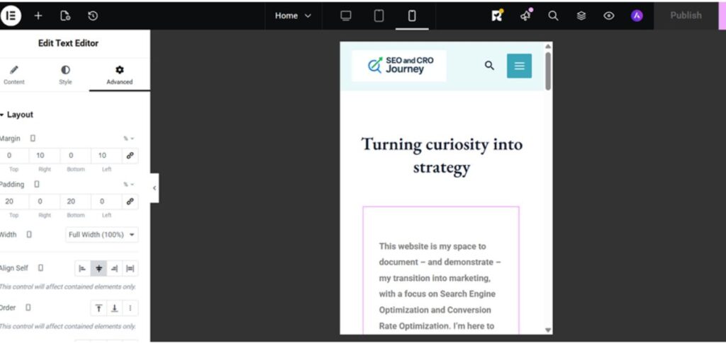
Elementor gives you an incredible amount of flexibility—but that flexibility only pays off if you design with mobile in mind from the start. When I built my first pages, I made the classic mistake: I focused entirely on the desktop layout. Everything looked perfect… until I switched to Tablet and Mobile views.
Suddenly, spacing collapsed, text ballooned in size, and columns stacked in ways I definitely didn’t expect. Elementor lets you toggle between Desktop, Tablet, and Mobile modes, but once I viewed my “perfect” design in Mobile mode, it was clear I had a lot more work to do.
I began fixing the homepage layout directly in Elementor’s Mobile view. Fortunately, the platform lets you make device-specific adjustments without ruining the desktop version—which is a lifesaver. Once everything looked great in Elementor, I checked the site on my actual phone… and it looked nothing like what I’d just designed. Total disappointment.
Hours of trial and error later, I finally got it looking good on my phone—only for my wife to check the same page on her phone and see a completely different layout again. At this point, confusion was an understatement.
Eventually, I learned that this is a common Elementor challenge: the Mobile preview inside the editor often looks different from how the site displays on real devices. And to make it even more fun, different phones render pages slightly differently too. The real solution? True mobile-responsive design, tested on multiple devices.
The Video Problem That Made Everything Worse
Just when I thought I was getting on top of things, I discovered another issue: background video on mobile.
I had a looped video playing on my homepage that looked great on desktop. But mobile? Nothing. Even tapping the play button did absolutely nothing. Then I tested it on my wife’s phone and—boom—it worked. Perfectly. Now I was extremely confused.
It turns out many mobile devices (especially certain browsers or battery-saving modes) block autoplay or background videos altogether. Some phones allow it, some don’t. It’s inconsistent, unpredictable, and honestly one of the more frustrating parts of building a website.
What Finally Improved My Mobile Layouts
After a lot of experimenting, I shifted to a responsive-first workflow. Elementor allows separate settings for:
- Desktop
- Tablet
- Mobile
And here are the adjustments that made the biggest difference to my mobile design:
Mobile-specific font sizes
Reduced padding and margins
Centered CTAs
Vertical stacking of columns
Hiding elements intended only for desktop
Simplify Your Mobile Navigation
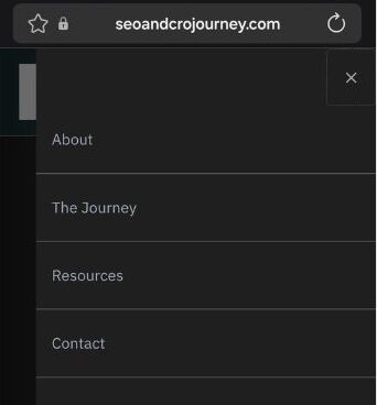
Navigation is often the first interaction mobile users have with your site. If the menu feels cluttered, confusing, or slow, visitors will leave quickly. Because of this, a simple and predictable mobile menu usually performs better.
Astra’s mobile header settings make navigation customisation straightforward. You can adjust:
- Menu type
- Logo size
- Sticky behaviour
- Spacing
- Visibility of menu items
A simple, mobile-friendly menu usually includes
- Home
- About
- Services / Portfolio
- Blog
- Contact
Fewer menu items result in faster decisions. Additionally, a clean structure helps users understand where they are and where they can go next.
Make Your Content Mobile-Friendly
Reading content on a phone feels very different from reading it on a laptop. Long paragraphs become exhausting. Dense text feels overwhelming. And spacing — something easy to ignore on desktop — suddenly becomes essential.
Mobile-friendly writing focuses on
- Short paragraphs of 1–3 lines
- Frequent, meaningful headings
- Generous spacing
- Clear transitions
- Buttons instead of text links
Additionally, breaking your content into digestible sections makes scrolling feel smoother. When readers aren’t forced to push through heavy blocks of text, engagement naturally improves.
A simple test is reading your homepage aloud while holding your phone. If the content feels heavy or slow, adjusting the structure often helps immediately.
Optimise Your Buttons and CTAs for Touch
Mobile users interact with their thumbs, not cursors. Because of this, CTAs must be intentionally sized and spaced. Otherwise, users will miss taps or avoid interacting altogether.
CTA guidelines that keep your site optimized for mobile
✔ Minimum tap target of 44px x 44px
✔ Generous padding
✔ High contrast
✔ Full-width or centred alignment
✔ Adequate spacing from other elements
Additionally, giving each page one clear action — instead of several competing ones — helps users understand what they should do next.
Improve Mobile Site Speed
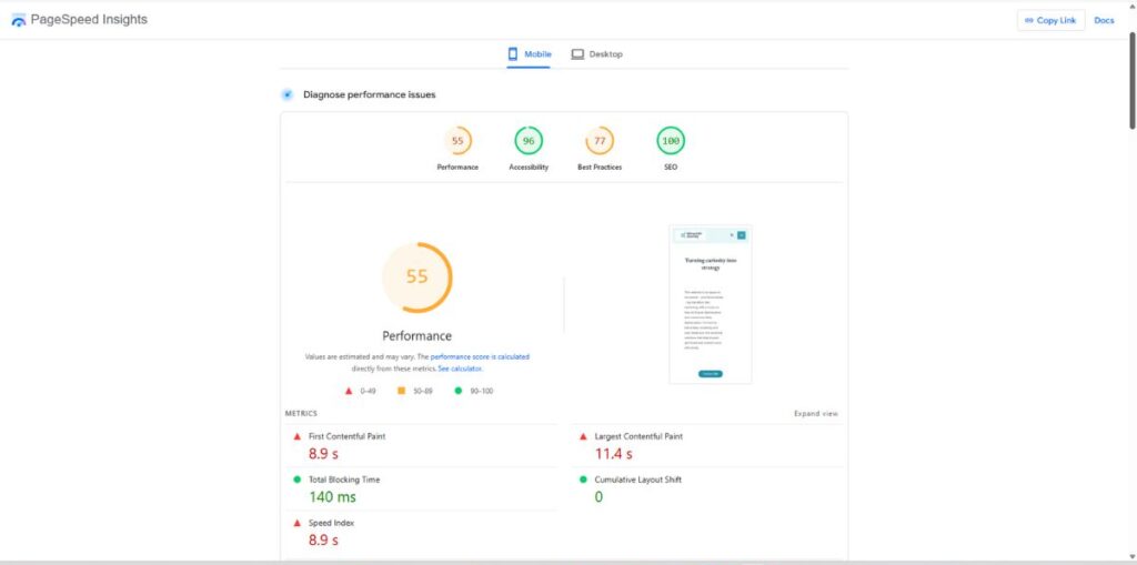
Speed is one of the most important factors for mobile optimisation. Phones often run on slower connections, and visitors expect instant loading. Consequently, even small delays feel magnified.
Tools to test your speed
PageSpeed Insights
GTmetrix
Quick speed improvements
- Use a caching plugin such as:
LiteSpeed Cache
WP Super Cache - Compress large images
- Limit animations
- Remove unused plugins
- Avoid heavy sliders
- Keep the homepage lean
After installing LiteSpeed Cache on my own site, my mobile performance score improved dramatically. Moreover, the pages simply felt faster.
Avoid Hover-Dependent Interactions
Hover effects enhance desktop experiences, but mobile devices can’t access them. Therefore, any element that depends on hovering — such as dropdowns or image overlays — becomes unusable on phones.
Replace hover interactions with
- Tap triggers
- Always-visible elements
- Simple icons
- Clear labels
Making these adjustments improves usability immediately. Additionally, tap-based interactions make your site feel more intuitive for visitors on all devices.
Test on Real Devices (Not Just in Elementor)
Although Elementor’s preview is helpful, it doesn’t capture everything. Different devices interpret spacing, fonts, and interactions differently. Because of this, real-device testing reveals issues that previews miss.
Test your site on
- Your own phone
- A family member’s phone
- Older devices
- Several screen sizes
Or use tools like
Chrome DevTools
Responsively App
BrowserStack
Additionally, each device gives you a slightly different perspective, helping you refine the experience without guessing.
Keep Only What Matters
Mobile optimisation often involves simplifying rather than adding. Because space is limited, unnecessary elements become distracting and even irritating.
Ask yourself
- Does this element add clarity?
- Does this image support the message?
- Does this animation help or distract?
- Does this section slow the page down?
Removing low-value elements makes the core message clearer. Furthermore, simplifying your layout often improves both engagement and speed.
Finish With a Mobile-First Review
Before publishing a page, I now scroll through it on my phone from top to bottom. This final pass highlights spacing issues, misaligned text, and missing links that I rarely notice on desktop.
Look for
✔ Readability
✔ CTA spacing
✔ Form usability
✔ Navigation clarity
✔ Speed
✔ Consistency
✔ Overall flow
Although this review sometimes means deleting sections I’ve spent time on, the end result always feels sharper, cleaner, and more intentional.
Final Thoughts
Being optimized for mobile is more than a technical requirement — it’s a commitment to the person holding the device. It challenges you to think about how they scroll, what they notice, and what slows them down. Moreover, it encourages a balanced mix of design, psychology, and usability
WordPress, Astra, and Elementor give you the tools to build a mobile-friendly experience. However, your willingness to iterate, test, and refine is what brings that experience to life. And if you’re building your own site or learning along the way, I’m glad you’re here for the journey.
Here’s to progress (and fewer 404s)
Chris


